Death Camp Devlog / GDTV2021-2022
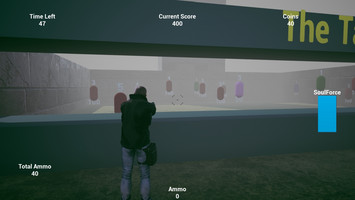
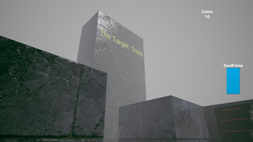
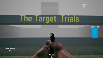
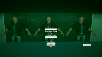
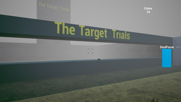
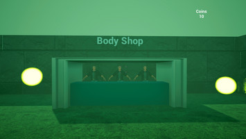
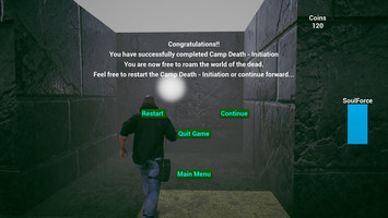
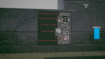

 Camp Death is my 4 game on itch.io and it's my second time taking part in the gamedev.tv game jam.
My first game, The Purgatory Curse, was my first game ever which was a submission for last years gamedev.tv" jam.
Taking part in this jam has been a great experience above and beyond the experience of being part of the awesome community on discord. This jam was very important for me personally, I wanted to see how much I have grown when I compare the 2 together and now I can.
Originally i planned on remaking the same game i made last year but better.
That was the first obstacle I had to get over. Last years game was seriously over-scoped but I managed to pull it together somehow. But for this year I realized, if i do know more than last year then it was guaranteed that I would never finish it. I would have made it more complex and lost even more sleep.
But I still wanted to try do it.
So I got a few refences from the net of some mazes (which I thought was my main level last year) and they tended to lean towards The Maze trials. I even watched the movie again and got a few screenshots as references.
I found a cool reference which was the inspiration of the maze now in the game. Don't think i can share it here but it was divided into 4 sections and each section had an open space but a different design and that's essentially what i went for.
Last year I had a target shooting level and thus, the Target Trials were born. hahaha
And naturally, the The Horde Trials is the zombie horde from last year.
The only part from last year i wasn't able to fit in was the Endless chase section, and believe me, I nearly made it in.
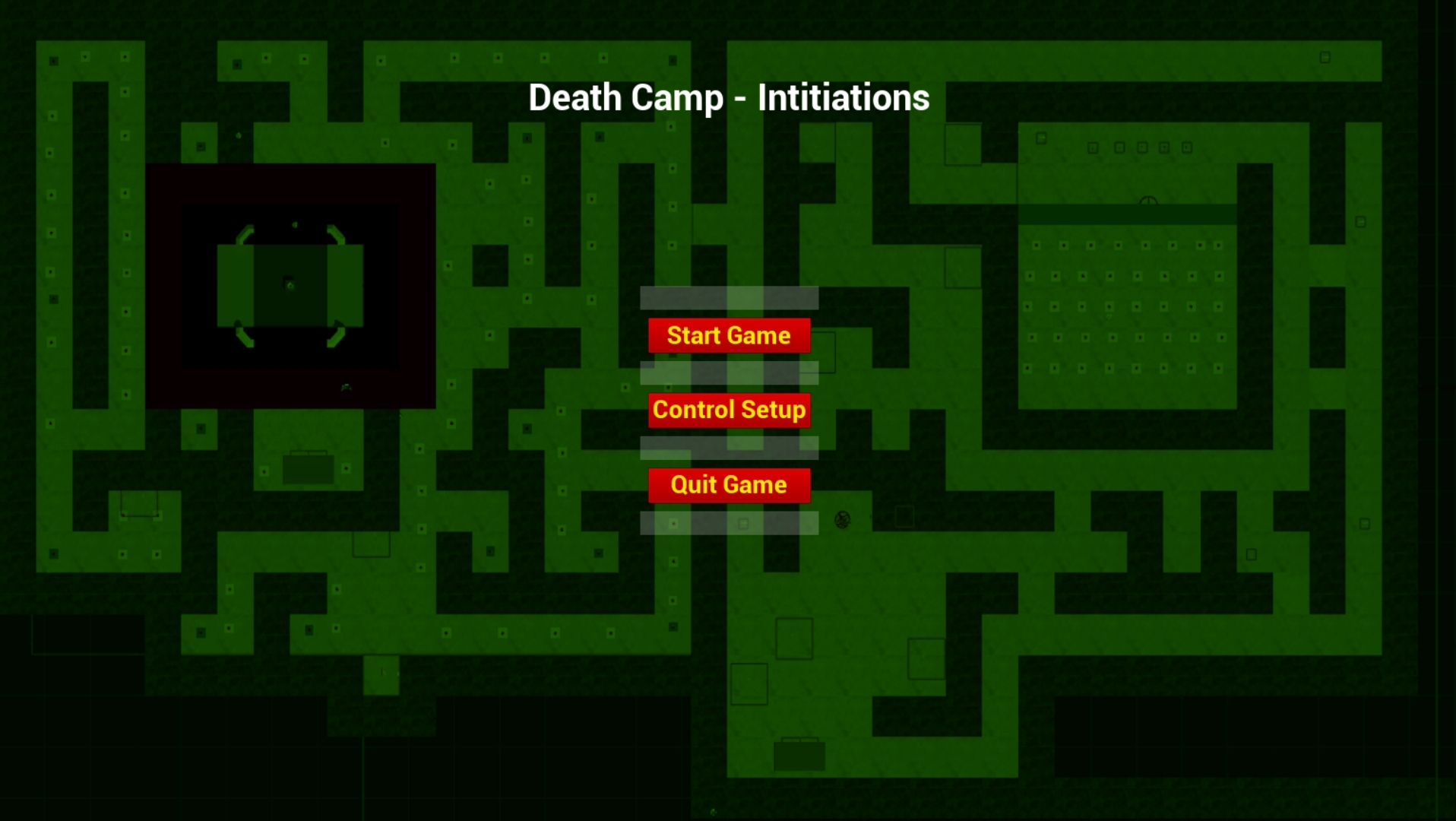
I just happened to be online when GDTV was streaming and Rick and Tim were talking about descoping and so i started looking at how to descope. In the screenshot you can see how the map looked at one stage. The long passage on the left was going to be the endless runner part.
The screenshot though was day after descoping. The map had 4 sections and the endless runner section. hahaha
I was constantly brainstorming the game story itself. Purgatory being replaced by Death this time. But i knew i had to do something more. Just a target course and a horde just wouldn't cut it.
Using the theme I tried to develop a type of story you could progress through. So I created the map boards and the floating orbs.
Truthfully, the orbs were originally just gonna be tutorial stuff but when i was adding the boards and inventing stuff for story and background they became more than just text objects. The more I worked on background though the more i started feeling that the game now had a direction.
I don't really see myself as an artist so I knew I would have a problem with creating a decent environment that would fit the game. I found a nice tutorial on a post process effect for fog and although I wanted it a bit darker I liked it. I did try to get it darker but was getting bad results so stuck with this one.
In the end, I made something I am very chuffed with. When I compare it to last years, I am fully satisfied. I can see for myself that I have definitely grown. I still have a long journey ahead of me but I felt so much more confident this time round and although the maze is a bit bland it does have an atmosphere which was much more than last years. hahaha
Instead of stressing and following tutorials all the way like last year I did most of the blueprint on my own. Not only was I able to implement the features I wanted but I was able to know what was happening most of the time unlike last years which I even today still wonder how it even worked in the first place.
I regret that I couldn't get the endless section in. I actually had a really nice idea for it with falling rocks and and everything but while banging away at some sort of a background for a world to play in I discovered something I liked even more.
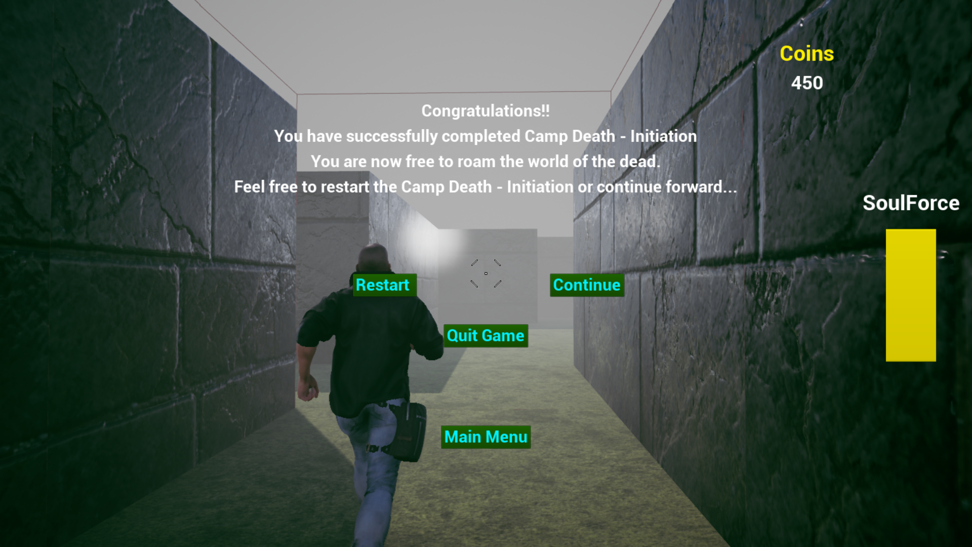
Camp Death started to become a world I wanted to build on and expand upon. And so my solution for finding a way to work in the endless runner was born.
Those that played my game last year may remember that the door to the endless chase had a sign that said ( under maintenance). The truth is that I ran out of time and simply had no idea how to make it better. I had seriously over-scoped big time.
So purely by accident (or was it design? :P) this years game has a continue button which leads you to a popup which says ( game unavailable try again later). Not exactly the same but I do feel it is an ode to it in a way.
What I learnt?
Hmmm... Well, I learnt a lot. I had to debug a lot of stuff so I definitely will have learnt a lot there. I won't go into detail on that. I don't see that as what was the important stuff I learnt.
Perhaps the biggest and most impact-full lesson I learnt from this jam and more specifically this game was depth.
Depth in story. Depth in game immersion. I may not have succeeded in creating a decent world with proper depth but when I compare it to last years game it is by far much better. When I look at last years game its world was a total mess. From bright neon colors to darkness and then floating cubes and floors and a maze that is so big with bright colors to a room that's got no character.
Camp Death for me is a much better world i created. and i feel that although I am not an artist I managed to put together an acceptable environment. I really wanted to add vines and such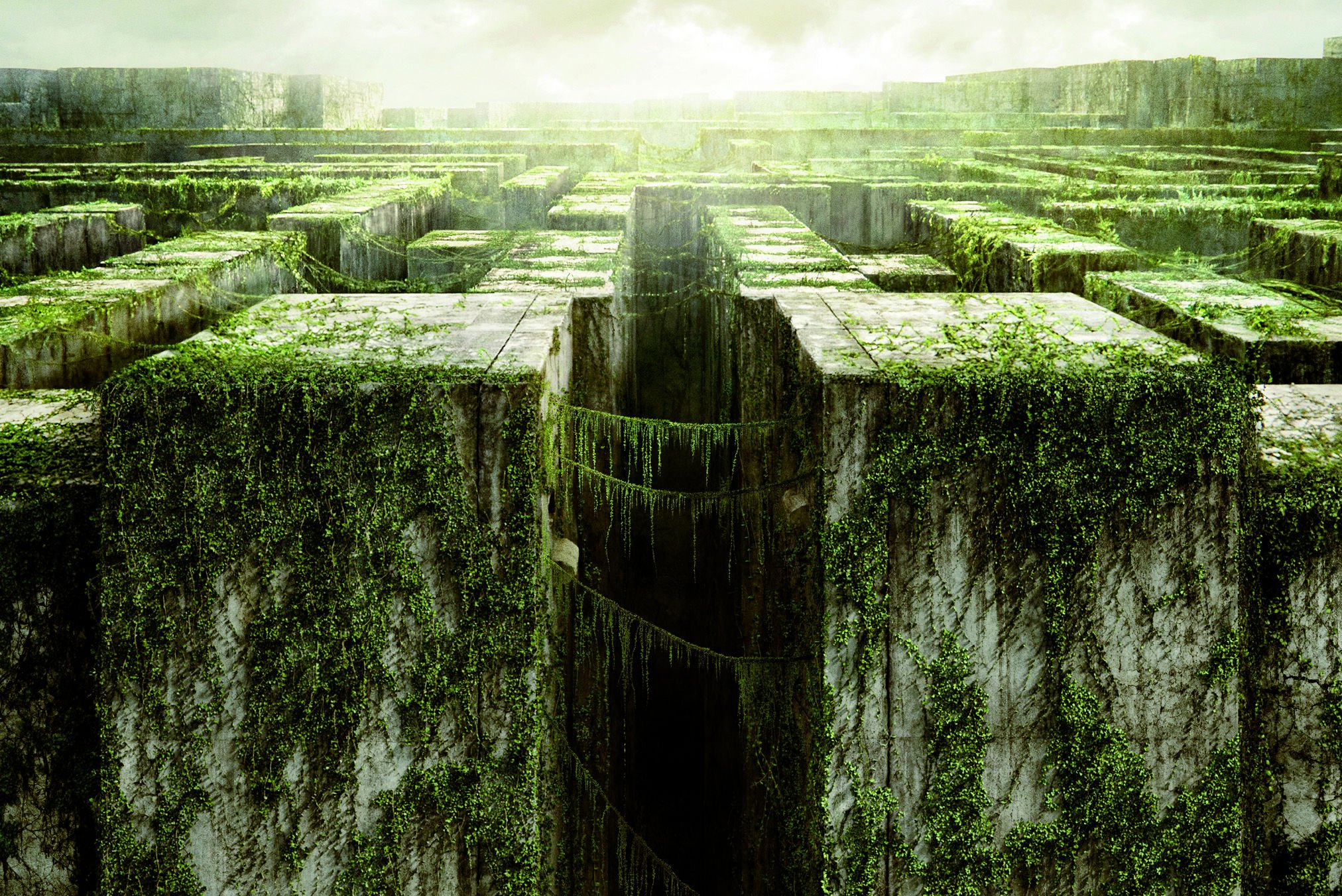
This one of the maze runner images I found which I essentially wanted the maze to look like. Hence the green when you have no body. But I have little to no experience with foliage so instead of trying to add foliage and create this type of environment, I decided to use post process for a different effect.
In the end I am very pleased at what I managed to do. I know it's not perfect, far from it, but I feel it's a much more developed game compared to last years and that is what makes Camp Death my new favorite.
While making this game I accidentally hit the imagination bone in my mind and a new idea sprung into action. Camp Death was gonna be called Camp Death - Initiation. The ending which was something I thought of the same night when I descoped was I think the actual culprit that instigated the hit on the Imagination bone.
I decided that I want to create this world. The Land of the Dead. Also known as Lod (from the game), is gonna become a project, and The D-Guard (referenced in game(name may change in future)) are going to be in this world and all the stuff from Camp Death. But anyway. :P
The second most important thing I learnt, and some would say probably should be the first, hahaha, is project size.
Yes. Project size is very, very important. I managed to get a lot of what I wanted done but if I had stuck to just the horde and left out the target trials I would have been able to create a much better horde. I could've had more time to focus on animations and AI movement and death effects and so much more. And vice versa, the target trials could have had a high scores system, with a difficulty level, and maybe even different weapons and different courses.
So yes. project size matters big time. But luckily this isn't one of those types of jams. making the best isn't the goal. Learning from it is. And that is why i say it's the second important one. It may not be a jam so then your project may be massive, but then, you break it into smaller chunks. Camp Death has 2 sections. They are very basic and simple and can do with a lot of artistic touch and even more code but if I had gone with 4 sections like i had originally planned, this would not be a success devlog but a sad song to my extreme failure at submitting anything. hahaha
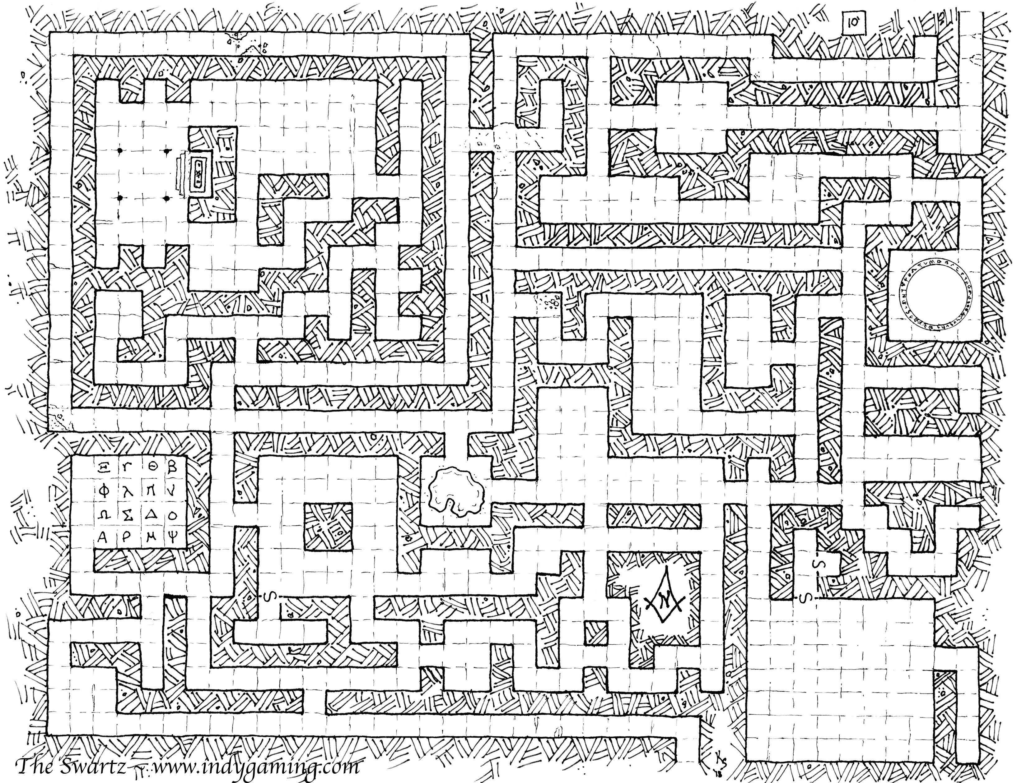
The original image for the inspiration for the design of the maze. I have no idea who made it but credit to them for an amazing source of inspiration. It really did break the block I was having.
What's important about why it is such a good reference is simply because it is just squares, All exactly the same width and length.
It made it very easy to create in top down view and thus very easy to create your own design.
Then also the top left and bottom right inspired the current map design in Camp Death. The horde being a combination of the circle and the top left.
But while designing my maze I wanted the character to progress through it instead of being able to reach any point whenever. And so this was the near end result.
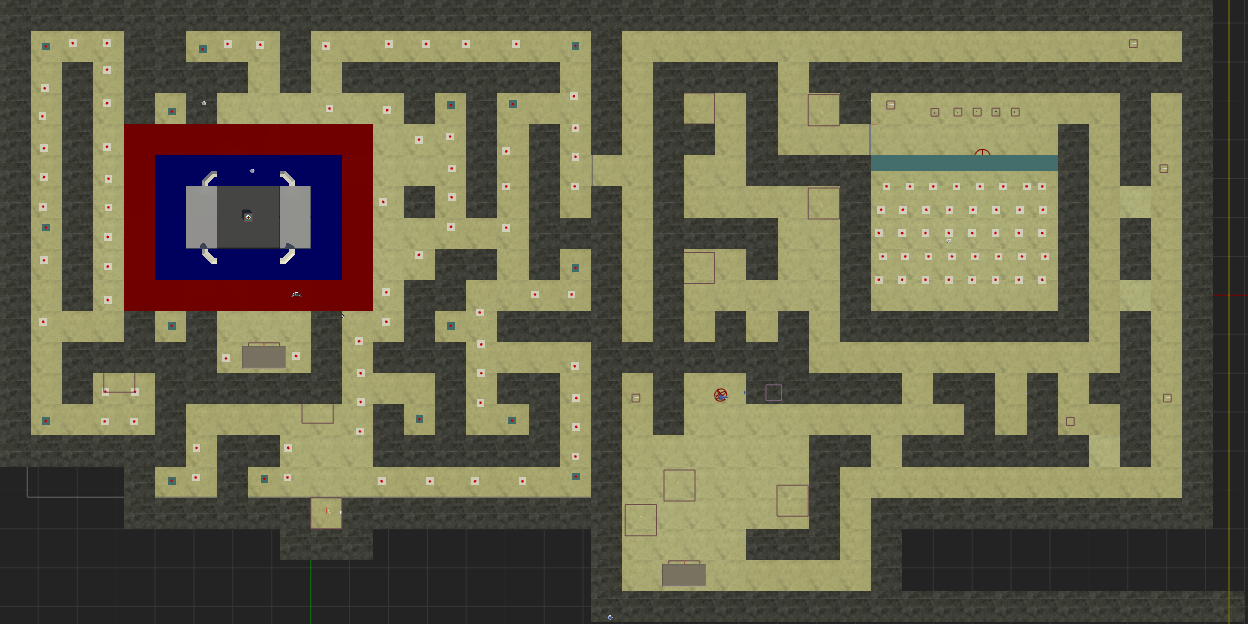
The player would start in one section and make their way through to the next. Using this method I thought would be a nice way to also teach the player how to play the game. I didn't quite succeed, but I think I did come close to having a smooth gameplay. The player starts of as a presence(no form or visual which was intended). I did consider using a mist or a smoke or maybe a transparent material on character, but, on some deep thought I decided that if you are dead then you won't be ghost in the land of the dead. In the land of the living, yes. But in Lod, you are just a presence. And so I stuck with that and tried to build it into the story. And so the body-shop was born.
One mistake I realized almost immediately upon submission was that, many would miss the storyline (background) simply cos they don't want to read. Something I definitely will take into account and improve upon.
I spent a bit more time this time on level design and environment. In fact the same post process i used for the fog is source for the idea for the intro scene where the world seems to divide out and then into itself. That's how I see it lol.. I don't know if it works on all pc's but I spent quite some time trying to get the timing right and I think that was my best moment( the games moment. And even the placing of the character had to be perfect for the effect to happen.
When you press start the outro text appears and the door closing on life plays. Then suddenly the split world with the bass sound timed right as the orb bounces into clear vision.
But there starts the true journey of my learning. To create a world I needed context. The orbs. I had to make sure the player knew they could read them. But I also had to make sure those that wont would maybe see the maps so I added texts to all of them as well. And they had to be placed in places where the player would be guaranteed to see them. brainstorming messages was both fun and hard. One idea is awesome and then you jump to another board and you suddenly hit a blank. It's tough out there guys. Coming up with stuff isn't always easy on the fly. hahaha
What i feel is missing is npc. I think an npc could have done well to replace some of the orbs. And now that i think about it even the shop could have been worked on more. But, yet again, we come straight back to descoping. hahaha
In fact I think the biggest thing missing is npc. I feel by adding npc the game would have been much more complete and the background would have been much easier to carry over to the player.
Essentially I was trying not to create a horde shooter or a target shooter but a world you wanted to explore and go into. Camp Death -Initiation is essentially an introduction to the Land of the Dead. Lod. And I was aiming at getting the player to be upset when they reach the end and press continue and there is no continue.
If I managed to get that reaction from anyone then I have succeeded in doing exactly what I wanted. An experience that someone wanted more of. A world someone wanted to find out more about and explore and discover what else was hidden.
And that brings me to the final lesson I learnt. Not actually final lesson, but final for this devlog.
A game is so much more than just a bunch of code slammed together. It's a combination of a lot of things that come together to form an experience. A story, a challenge, a test of skill.
But they have to fit in together. Last years game was a combination of bad experiences. hahaha. But they didn't fit in either and that made it even worse. This years I feel is even a little enjoyable compared to last years but I feel it does all fit together even if a bit vague at times.
Consistency I found to be a key ingredient in this part of development. Using the same colors (even if they dull), the same references and map-boards to be placed in many places with the same look (even if they were boring) made sure that the maze wouldn't look out of place. But also the orbs and the text messages themselves. The more they referenced the same topics the more the player would be sure to know more about the world (at least that was the idea). The same things and words and references and shapes etc, all play a part in creating a world. Instead of trying to make it flashy and cool, make it fit first.
I may have failed in that regard but that's why I say it's a lesson I learnt as well. :)
All in all I think I have really grown over the year. I do understand the engine way better but when it comes to game creation beyond the engine knowledge, that is where I feel I have only just touched the surface of and I feel it's time I start focusing more on not how to create targets but how to add those targets to the world and how to make them part of the world and not just some code I learnt so here you go.
And that's the end...
...of this devlog. :P
Thanks for taking the time to read this. It's been a pleasure taking part in this jam and an honor to have been able to do it twice and if you play it after reading this i would love to know what you thoughts are and if I actually did catch some sort of excitement for a world yet to be made.
Files
Get Camp Death - Initiation
Camp Death - Initiation
My submission for the Gamedev.TV Jam. Themed "Death is only the beginning"
| Status | In development |
| Author | Petraefa |
| Genre | Action, Shooter |
| Tags | 3D, Dark, First-Person, Singleplayer, Survival Horror |
Leave a comment
Log in with itch.io to leave a comment.